![DESIGN REMARKS [デザインリマークス]](https://design-remarks.com/wp-content/themes/design_remarks/svg/svg_dr_logo.svg)
tableを使う機会は減ったと思います。いざ使うときにソースの書き方を忘れてしまったりはしていませんか?
よく使うtableレイアウトのパターンを、HTMLとCSSのソースコードと共にまとめました。コピペ用に使っていただければと思います。
ベーシックなtableレイアウト
| 項目1 | 項目2 | 項目3 |
|---|---|---|
| 内容1-A | 内容2-A | 内容3-A |
| 内容1-B | 内容2-B | 内容3-B |
HTML
<table>
<thead>
<tr>
<th>項目1</th>
<th>項目2</th>
<th>項目3</th>
</tr>
</thead>

<tbody>
<tr>
<td>内容1-A</td>
<td>内容2-A</td>
<td>内容3-A</td>
</tr>

<tr>
<td>内容1-B</td>
<td>内容2-B</td>
<td>内容3-B</td>
</tr>
</tbody>
</table>
CSS
table{
    border-collapse: collapse;
    color: #3a4d5b;
    margin:0 0 10px 0;
}
table tr th{
    border: solid 1px #99ccc6;
    background-color: #f5ffff;
    padding: 5px;
}
table tr td{
    border: solid 1px #99ccc6;
    padding: 5px;
}
最もベーシックなtableレイアウトです。theadやtbodyを省略することが多いと思いますが、基本的は書くようにした方が良いかと思います。widthの指定をしていないので、内容の量によってセルの大きさが変わるタイプです。
項目が縦のtableレイアウト
| 項目1 | 内容1-A | 内容1-B |
|---|---|---|
| 項目2 | 内容2-A | 内容2-B |
| 項目3 | 内容3-A | 内容3-B |
HTML
<table>
<tr>
<th>項目1</th>
<td>内容1-A</td>
<td>内容1-B</td>
</tr>

<tr>
<th>項目2</th>
<td>内容2-A</td>
<td>内容2-B</td>
</tr>

<tr>
<th>項目3</th>
<td>内容3-A</td>
<td>内容3-B</td>
</tr>
</table>
CSS
table{
    border-collapse: collapse;
    color: #3a4d5b;
    margin:0 0 10px 0;
}
table tr th{
    border: solid 1px #99ccc6;
    background-color: #f5ffff;
    padding: 5px;
}
table tr td{
    border: solid 1px #99ccc6;
    padding: 5px;
}
これもベーシックなスタイルですが、項目を縦にしたレイアウトです。thが分散するので、theadの括りは作っていません。
総当たり表のtableレイアウト
| 列項目1 | 列項目2 | 列項目3 | |
|---|---|---|---|
| 行項目A | 内容2-A | 内容3-A | |
| 行項目B | 内容1-B | 内容3-B | |
| 行項目C | 内容1-C | 内容2-C |
HTML
<table class="table_B">
<tr>
<th class="empty"></th>
<th>列項目1</th>
<th>列項目2</th>
<th>列項目3</th>
</tr>

<tr>
<th>行項目A</th>
<td class="empty"></td>
<td>内容2-A</td>
<td>内容3-A</td>
</tr>

<tr>
<th>行項目B</th>
<td>内容1-B</td>
<td class="empty"></td>
<td>内容3-B</td>
</tr>

<tr>
<th>行項目C</th>
<td>内容1-C</td>
<td>内容2-C</td>
<td class="empty"></td>
</tr>
</table>
CSS
table.table_B{
    margin: 0 0 10px 0;
    border-collapse: collapse;
    width:auto;
}
table.table_B tr th{
    padding: 5px;
    border: solid 1px #000;
    width: 80px;
    height: 80px;
}
table.table_B tr td{
    padding: 5px;
    border: solid 1px #000;
    width: 80px;
    height: 80px;
}

th.empty,td.empty{
    background: linear-gradient(45deg,transparent 0%,transparent 49.5%,#5f5f5f 49.5%,#5f5f5f 50.5%,transparent 50.5%,transparent 100%);
}
スポーツの対戦の総当り表などでよく使うタイプです。ポイントは空のセルに斜線を入れるところです。斜線はclass=”empty”を用意し、CSSのbackground: linear-gradientを利用して書いています。斜線の角度が一定のため、セルの比率は1:1の正方形を維持することで、角から角へ線がずれることなく引かれるようにしています。
2カラムでwidth100%、項目の幅は固定のtableレイアウト
| 列項目1 | 列項目2 |
|---|---|
| 行項目1 | 内容1-A |
| 行項目2 | 内容1-B |
| 行項目3 | 内容1-C |
HTML
<table class="table_C">
<tr>
<th class="t_head">列項目1</th>
<th>列項目2</th>
</tr>

<tr>
<th class="t_head">行項目1</th>
<td>内容1-A</td>
</tr>

<tr>
<th class="t_head">行項目2</th>
<td>内容1-B</td>
</tr>

<tr>
<th class="t_head">行項目3</th>
<td>内容1-C</td>
</tr>
</table>
CSS
table.table_C{
    margin: 0 0 30px 0;
    border: solid 1px #000;
    border-collapse: collapse;
    color: #3a4d5b;
    width: 100%;
}
table.table_C tr th{
    border: solid 1px #99ccc6;
    background-color: #f5ffff;
    padding: 5px;
}
table.table_C tr th.t_head{
    width: 100px;
}
table.table_C tr td{
    border: solid 1px #99ccc6;
    padding: 5px;
}
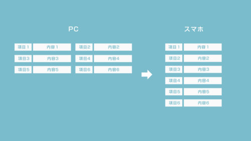
レスポンシブでは画面幅によってテーブルも伸縮して欲しいので、width:100%を指定しますが、項目名はwidthをpx指定で固定します。このタイプもよく使います。
項目が固定でスクロールできるtableレイアウト
| 列見出しA | 列見出しB | 列見出しC | 列見出しD | 列見出しE | 列見出しF | 列見出しG | 列見出しH | 列見出しI | 列見出しJ | 列見出しK | |
|---|---|---|---|---|---|---|---|---|---|---|---|
| 行見出しA | contents | contents | contents | contents | contents | contents | contents | contents | contents | contents | contents |
| 行見出しB | contents | contents | contents | contents | contents | contents | contents | contents | contents | contents | contents |
| 行見出しC | contents | contents | contents | contents | contents | contents | contents | contents | contents | contents | contents |
| 行見出しD | contents | contents | contents | contents | contents | contents | contents | contents | contents | contents | contents |
| 行見出しE | contents | contents | contents | contents | contents | contents | contents | contents | contents | contents | contents |
| 行見出しF | contents | contents | contents | contents | contents | contents | contents | contents | contents | contents | contents |
| 行見出しG | contents | contents | contents | contents | contents | contents | contents | contents | contents | contents | contents |
| 行見出しH | contents | contents | contents | contents | contents | contents | contents | contents | contents | contents | contents |
| 行見出しI | contents | contents | contents | contents | contents | contents | contents | contents | contents | contents | contents |
| 行見出しJ | contents | contents | contents | contents | contents | contents | contents | contents | contents | contents | contents |
HTML
<table class="sticky_table">
  <thead>
    <tr>
      <th class="blank"></th>
      <th>列見出しA</th>
      <th>列見出しB</th>
      <th>列見出しC</th>
      <th>列見出しD</th>
      <th>列見出しE</th>
      <th>列見出しF</th>
    </tr>
  </thead>
  <tbody>
    <tr>
      <th>行見出しA</th>
      <td>contents</td>
      <td>contents</td>
      <td>contents</td>
      <td>contents</td>
      <td>contents</td>
      <td>contents</td>
    </tr>
    <tr>
      <th>行見出しB</th>
      <td>contents</td>
      <td>contents</td>
      <td>contents</td>
      <td>contents</td>
      <td>contents</td>
      <td>contents</td>
    </tr>
    <tr>
      <th>行見出しC</th>
      <td>contents</td>
      <td>contents</td>
      <td>contents</td>
      <td>contents</td>
      <td>contents</td>
      <td>contents</td>
    </tr>
    <tr>
      <th>行見出しD</th>
      <td>contents</td>
      <td>contents</td>
      <td>contents</td>
      <td>contents</td>
      <td>contents</td>
      <td>contents</td>
    </tr>
    <tr>
      <th>行見出しE</th>
      <td>contents</td>
      <td>contents</td>
      <td>contents</td>
      <td>contents</td>
      <td>contents</td>
      <td>contents</td>
    </tr>
    <tr>
      <th>行見出しF</th>
      <td>contents</td>
      <td>contents</td>
      <td>contents</td>
      <td>contents</td>
      <td>contents</td>
      <td>contents</td>
    </tr>
    <tr>
      <th>行見出しG</th>
      <td>contents</td>
      <td>contents</td>
      <td>contents</td>
      <td>contents</td>
      <td>contents</td>
      <td>contents</td>
    </tr>

  </tbody>
</table>
CSS
table.sticky_table {
  display: block;
  overflow: scroll;
  width: 100%;
  height: 300px;
  border-collapse: collapse;
}
table.sticky_table thead,
table.sticky_table tbody {
  display: block;
  width: -webkit-max-content;
  width: -moz-max-content;
  width: max-content;
}
.sticky_table th,
.sticky_table td {
  width: 100px;
  padding: 5px;
  background: #fff;
  font-size: 12px;
  border: solid 1px #99ccc6;
}
.sticky_table th{
  border: solid 1px #99ccc6;
  background-color: #f5ffff;
}
.sticky_table tbody th {
  position: -webkit-sticky;
  position: sticky;
  left: 0;
  z-index: 1;
}
.sticky_table thead {
  position: -webkit-sticky;
  position: sticky;
  top: 0;
  z-index: 2;
}
.sticky_table thead th.blank {
  position: -webkit-sticky;
  position: sticky;
  top: 0;
  left: 0;
  z-index: 3;
}
position:stickyを使った少し特殊なテーブルレイアウトです。項目のセルが固定表示されたまま、スクロールすることができます。まさにExcelのような表現ができます。
この表現は注意が必要で、 position:stickyがIEでは効かないため、項目も含めてスクロールされてしまいます。また、stickyの仕様もよく理解しながら使うことをお勧めします。
まとめ
tableレイアウトのよく使うパターンとしてはこれぐらいかと思います。基本的にコピペで使える状態になっています。色と文字サイズだけ調整すれば、いろいろなサイトデザインになじむと思います。
他にも便利なレイアウトを見つけたら追加していきます。